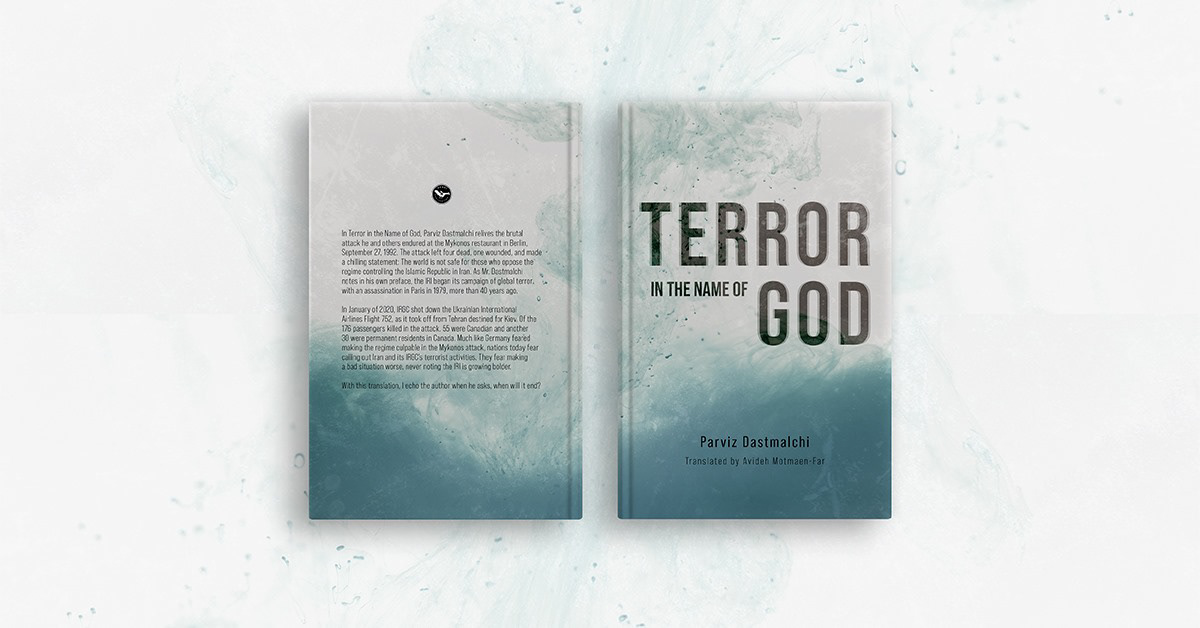
For this cover we decided to go with a more abstract yet minimalistic approach, the textures used for this background are a representation of the violence experienced by the author and the terror that is being described in the narrative of the book.
The type treatment is also looking to reflect the imposing image of the regime and the terror described by Dastmalchi.
To summarize, we wanted to look for ways to represent the experiences of the book without being too graphic or literal, this is also reflected on the colour palette, by avoiding bold reds that would be normally associated with blood and danger.